Visualizzazione post con etichetta Pantone. Mostra tutti i post

venerdì 19 aprile 2013

Friday Fav: Pattern by Orla Kiely

She is one of the most important designer in Uk and she loves being considered the queen of the pattern kingdom. If you like both the 1960's and 1970's-style you can not resist to the visionary brand of Orla Kieley. Orla grew up in Ireland and after a degree in design at Dublin's Nationa College of Art and Design she entered in the Esprit Maison. Then she founded her own brand and now the store in London's Covent Garden is the epicentre of her empire.
I have read this book immediately: it is so inspiring and it has delighted my eyes, really!
Traditional florals, sprigged prints and powerful colours are the essential ingredients of patterns.
Do you like Orla Kieley?

Pattern is not a trend for me, to be taken up one minute and abandoned the next when the winds of fashion change. Pattern is in me. It is my life.
Pattern Orla Kiely, p. 13.

op4op5op62_photo0060

sabato 7 aprile 2012

Just a saturday before Easter

Felice pasqua a tutti! Ho collezionato le immagini più carine che ho incontrato navigando: uova colorate, ricette squisite e stoffe colorate!

Happy Easter everyone! I've collected the prettiest pics of colored eggs, delicius recipes and colored fabrics.

DIY Pantone Easter Eggs from How about Orange (link)

From Finer Thing Co a lot of cute ideas for this Easter! (link)

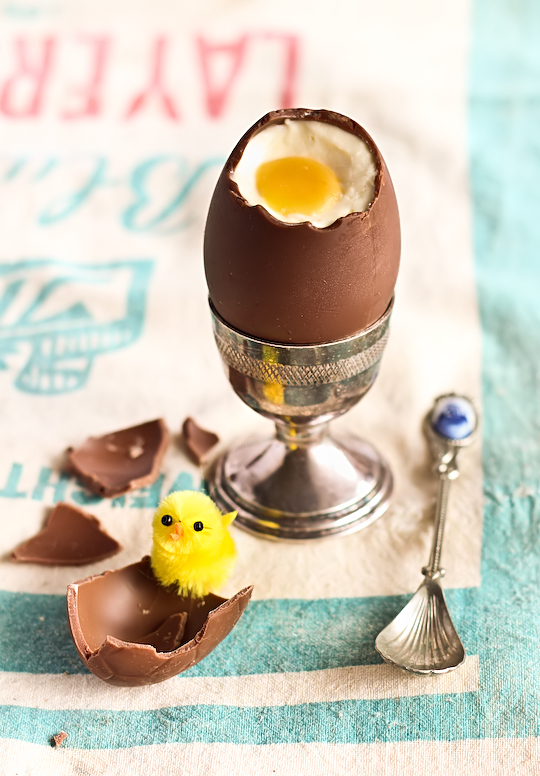
Cheesecake Filled Chocolate Easter Eggs from Raspberri Cupcakes (link)

Easter window of the Koti Design Shop in Perugia (filled with Marimekko fabric) (link)

...and a little english presents for my italian best friends ;)
 Loli piggy easter choco egg for @wagashistories hiih

venerdì 23 settembre 2011

Pantone fashion textures: fall 2011

La prima sensazione che ho avuto nel vedere le palettes promosse da Pantone per la stagione autunnale è stata una piacevole sorpresa.
Credo che l'autunno sia una stagione ricca di contrasti, in cui le giornate possono offrire venti gelidi e raggi caldi di sole. I colori neutri quali grigi, verdi e marroni si sposano bene con punte di accesi colori caldi e freddi. Il resto è una questione di gusto e sensibilità.
Di sicura ispirazione per me saranno i colori Cedar, Coffee Liquèur, Quarry e Nougat. Per voi invece?

“Designers take a painterly approach to fall 2011 by artfully combining bright colors with staple neutrals, reminiscent of how an artist would construct a stunning work of art,” said Leatrice Eiseman, executive director of the Pantone Color Institute®. “Much like a painter's masterpiece, there is a certain romance to this season's palette.”
I love the Cedar, Coffee Liqueur, Quarry and Nougat color, and you?
Take your colors autumn survey!

martedì 28 dicembre 2010

18-2120 Honeysuckle - Rosa Caprifoglio


Honeysuckle (rosa caprifoglio) sarà il colore di tendenza delle prossime collezioni di moda primavera/estate.
Così i designers newyorkesi dettano le tendenze della moda e della bellezza.
"Honeysuckle è un colore accattivante, stimolante e adrenalinico, perfetto per scongiurare tristezza e malinconia. La positività di questo colore deriva dal forte legame con il suo colore madre, il rosso, che presenta le tonalità più fisiche e visceralmente vive di tutto lo spettro dei colori”.
Così commenta Leatrice Eiseman, executive director del Pantone Color Institute®.

Each year, Pantone selects "the" color of the year to dictate trends in fashion and home, and gives it a special meaning for the year ahead. For 2010, they selected turquoise, and for 2011, it's bright, celebrational Honeysuckle Pink.

Courageous. Confident. Vital. A brave new color, for a brave new world.

Energizing Honeysuckle lifts sprits and imparts confidence to meet lifes ongoing challenges.

Tips found on the web

FashionTrendsetter via shopstyle.com


Miss Bea Heyvin via shopstyle.com


Related Posts Plugin for WordPress, Blogger...